
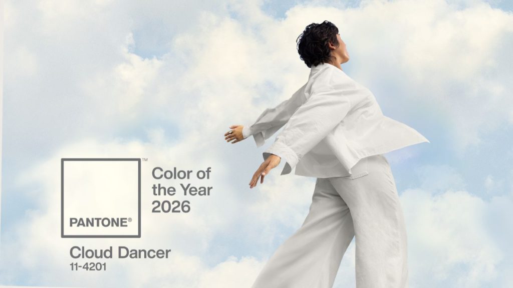
Every year, the announcement of Pantone’s Color of the Year sparks conversations across fashion, interior design, branding, and product development. For 2026, Pantone introduced “Cloud Dancer”, a soft, airy white that emphasizes calmness, clarity, and restraint.
At first glance, a neutral white may seem understated compared to the bold, expressive colors of previous years. Yet this choice reflects a broader shift in how brands think about design, presence, and material honesty. For packaging—especially sustainable, fiber-based packaging—the relevance of this color trend goes beyond aesthetics.
This article explores what Pantone Color of the Year 2026 represents, and more importantly, how it intersects with the realities of sustainable packaging design, where materials, processes, and performance matter just as much as visual tone.
What Is Pantone Color of the Year 2026?
Pantone’s Color of the Year is not a regulation or a technical standard. It is a cultural signal—a reflection of global mood, consumer psychology, and design direction. The selected color often influences branding, product launches, and visual communication across industries for the coming year.
For 2026, Pantone selected Cloud Dancer, a warm, gentle white with subtle depth. Unlike stark, high-contrast whites, Cloud Dancer is intentionally soft. It is designed to feel breathable, quiet, and grounded rather than clinical or minimalistic in a cold sense.
In practical terms, this color speaks to restraint rather than attention-grabbing. It suggests a move away from visual noise and toward designs that allow materials, structure, and texture to speak more clearly.
Why “Cloud Dancer” Feels Right for 2026
The choice of a soft white for 2026 is not accidental. Across many markets, brands and consumers are experiencing fatigue from overstimulation—bright colors, aggressive graphics, and constant visual competition.
In response, design language is becoming calmer and more intentional. Neutral palettes, muted finishes, and low-saturation tones are increasingly used to convey trust, longevity, and emotional comfort.
“Cloud Dancer” fits this direction well. It does not demand attention. Instead, it supports designs that feel balanced and considered. In branding terms, it allows other elements—material choice, form, typography, and texture—to take precedence.
For packaging, this shift aligns naturally with sustainability conversations. Many fiber-based materials already sit within this neutral visual range, making soft whites and natural tones a familiar and comfortable space rather than a forced trend.
Color Trends Are Visual — Packaging Is Material
While Pantone’s Color of the Year is visually influential, packaging design operates within a material system, not just a color palette.
Color trends are about perception. Packaging decisions, however, must balance:
- Material performance
- Manufacturing feasibility
- Compliance and safety requirements
- Cost and supply stability
- End-of-life considerations
A “white-looking” package can be achieved in many ways, but the process behind that appearance varies significantly depending on the material. In fiber-based packaging, color is inseparable from pulp source, processing methods, and finishing techniques.
This is where design trends and packaging reality often diverge. A visual reference like Cloud Dancer may inspire direction, but it cannot define how a package should be engineered or produced.
What “Soft White” Really Means in Fiber-Based Packaging

In molded pulp and bagasse-based packaging, white or off-white tones are common and expected. However, it is important to clarify what this whiteness represents.
Sugarcane bagasse packaging typically starts with processed pulp boards supplied by upstream mills. These pulp boards are already refined and whitened during the pulping stage, following standard industry practices. When packaging manufacturers source bagasse pulp boards, they are working with a material that has already undergone controlled processing to achieve consistency, cleanliness, and usability.
This means that the “white” appearance of bagasse packaging is not the result of last-minute cosmetic treatment, but part of a stable, standardized raw material system. It supports product safety, structural consistency, and predictable production outcomes.
That said, fiber-based materials still retain natural variation. Even when produced from the same pulp board, molded pulp products may show subtle differences in tone, texture, or surface finish. This is not a defect—it is a characteristic of molded fiber materials.
Many brands working with sustainable packaging now recognize that absolute color uniformity is not always the goal. Instead, they prioritize:
- Material authenticity
- Clean, neutral appearance
- Consistency within reasonable tolerance
- Alignment with sustainability values
In this context, Cloud Dancer does not represent a specific color target to be matched precisely. Rather, it reinforces the acceptance of soft whites and gentle neutrals as intentional design choices.
The Role of Processing and Surface Finish
In fiber-based packaging, surface appearance is influenced by multiple factors:
- Pulp formulation
- Production process (dry press vs. wet press)
- Heat pressing parameters
- Mold design and surface treatment
These factors affect not only color perception but also texture and tactile feel. A smoother surface may appear lighter and more uniform, while a more textured surface emphasizes the natural fiber structure.
Designers increasingly use this variation intentionally. Instead of chasing a perfectly flat white surface, they allow fiber texture to remain visible, reinforcing the material story behind the packaging.
This approach aligns well with the spirit of Cloud Dancer—not as a precise shade, but as a design attitude that favors softness, honesty, and restraint.
How Brands Are Moving Beyond Color in 2026 Packaging Design
As sustainability matures from a marketing concept into a practical requirement, brands are shifting focus away from color alone and toward broader system thinking.
In packaging design for 2026 and beyond, we are seeing increased attention to:
- Structural simplicity
- Reduced material complexity
- Fewer coatings and mixed materials
- Functional design that supports logistics and protection
- Visual calm rather than decorative excess
Color still matters, but it is no longer the primary driver. Instead, it supports the overall design logic rather than defining it.
Soft whites, natural fiber tones, and understated finishes help packaging feel timeless rather than trend-driven. This is especially relevant for custom molded pulp packaging, where color is not just a visual choice, but part of how brands communicate cleanliness, material honesty, and long-term consistency.
A Practical Note for Brands Exploring Sustainable Packaging in 2026
Pantone’s Color of the Year can be a useful reference point for understanding broader design direction. However, packaging decisions require a deeper conversation—one that considers material behavior, manufacturing reality, and long-term supply considerations.
For brands planning 2026 product launches, the key question is not whether packaging can match a specific color reference, but whether it aligns with:
- Your sustainability goals
- Your functional requirements
- Your production and logistics constraints
- Your brand’s long-term visual identity
Fiber-based packaging naturally fits within the soft, neutral design language highlighted by Cloud Dancer. When approached thoughtfully, it offers a balance between visual clarity and material integrity—without forcing artificial precision where it does not belong.

If you are exploring molded pulp packaging options for upcoming projects, practical insight matters more than trend interpretation. Material samples, structural testing, and realistic expectations will always deliver better outcomes than color matching alone.
Final note
This article intentionally focuses on understanding, not selling. At InNature Pack, we believe sustainable packaging works best when design trends are viewed as guidance—not rules—and when material decisions are made with clarity, honesty, and real-world performance in mind.